Ref PR 03 · Practice and business How to build an online art portfolio
Method Edition of 20/08/2026 also filed under: presentation, self promotion
Portfolio: a short, ordered selection of finished work whose only job is to make a commissioner believe you can make a particular kind of picture on request.
In short
- Show only the work you want to be hired to make again.
- The weakest piece sets the level, not the strongest.
- Every piece needs a caption that says what the job was.
1. What a folio is for
A commissioner looking at a folio is answering one question: can this person make the picture I need, on time, without supervision. Everything that helps answer it belongs. Everything else, including the work you are fond of and the work that took longest, is noise.
That is why an archive is a bad folio. An archive shows range across years; a folio shows control over one thing right now.
2. The edit
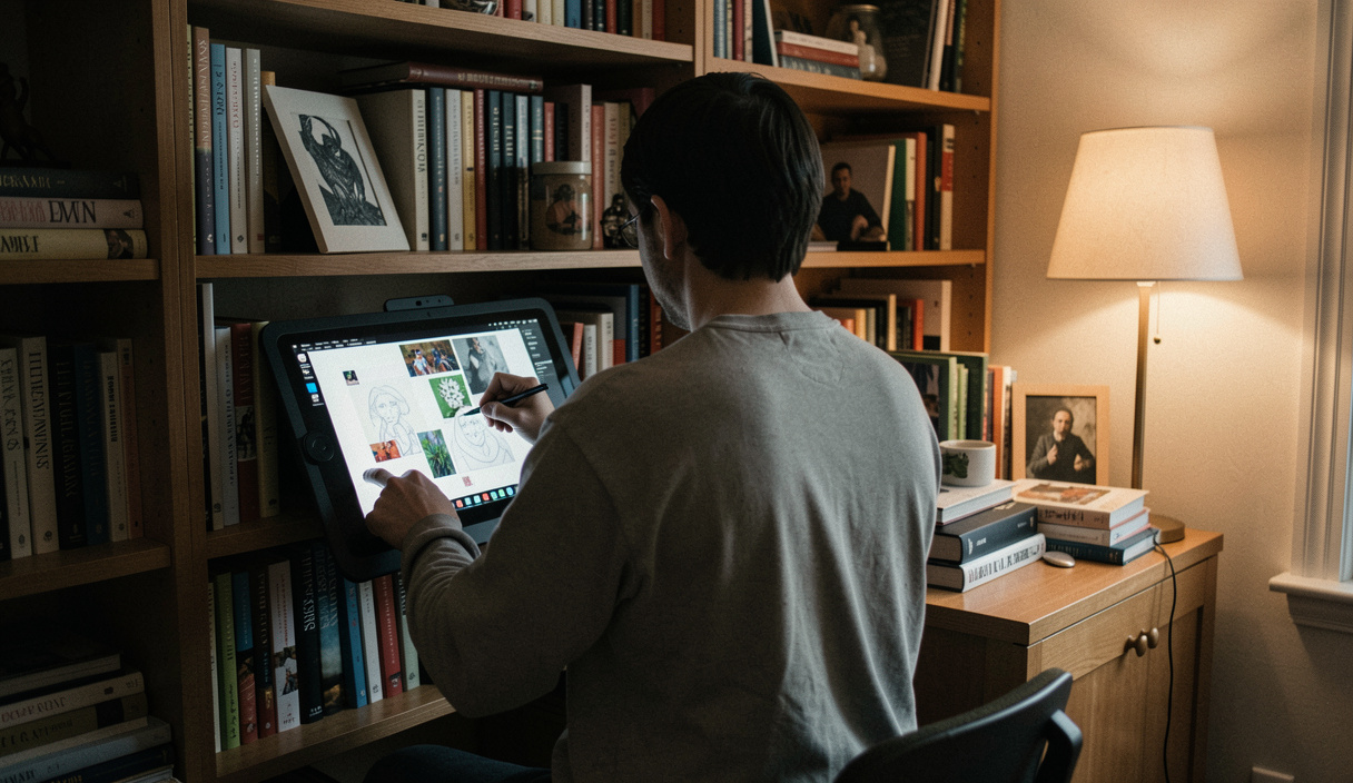
Cut first, arrange later. A general folio of twelve to twenty pieces is enough for most markets; a folio aimed at a single commissioner is stronger at eight to twelve. The count matters less than the consistency: if a viewer cannot say what you make after four pictures, the edit has failed.
- Remove student exercises, fan art that copies another designer's character, and anything you would not want to be asked to repeat.
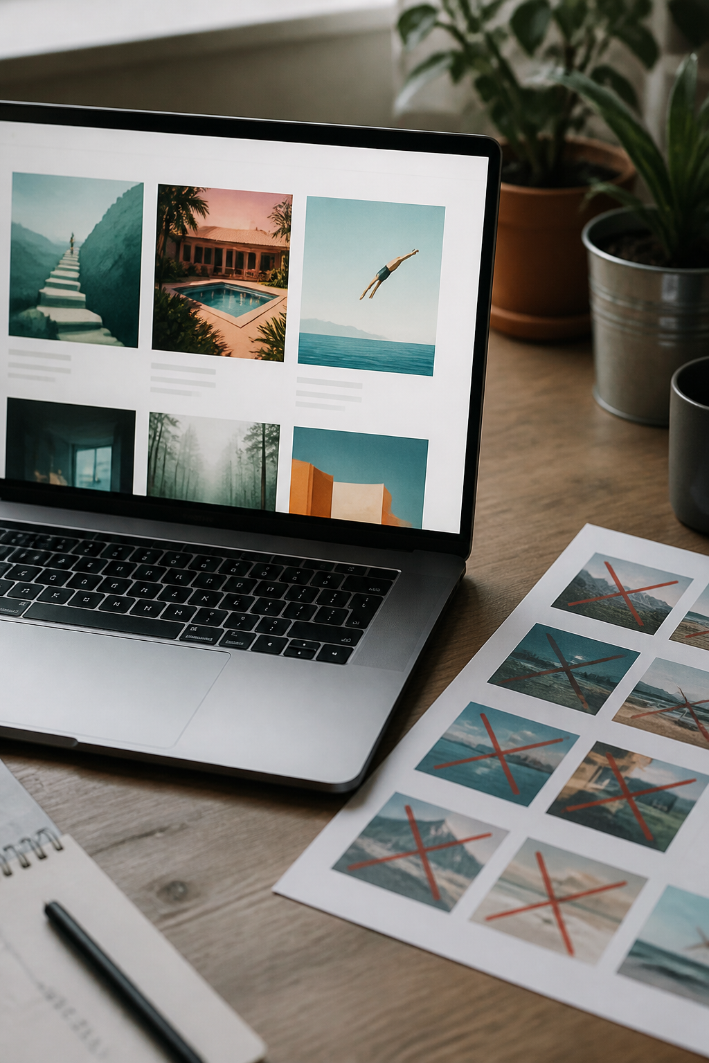
- Remove near duplicates. Two versions of the same idea halve the strength of both.
- Keep unpublished personal work if it points at the jobs you want next. Commissioners do not mind that it was self set; they mind that it is weak.
- If a piece needs an explanation to work, it is not a folio piece.
3. Order and grouping
Open with your strongest piece and close with the second strongest. Group by market or by kind of job, never by chronology: a commissioner who came for book covers should not have to scroll through packaging to find them.
If you genuinely work in two distinct areas, give them two sections with their own landing pages rather than mixing them in one grid. Mixed grids read as indecision.
| Viewer | What they are checking | What convinces them | What loses them |
|---|---|---|---|
| Editorial art director | Speed, reading, ideas | Concept driven images with captions naming the article | A folio with no published work and no dates |
| Publisher or agent | Consistency across a book length job | A set in one voice, plus a character kept stable | One brilliant piece surrounded by unrelated ones |
| Studio recruiter | Fit inside a pipeline | Work in a stated style guide, with your part named | Uncredited team work presented as solo |
| Brand or agency | Reliability and rights literacy | Campaign scale pieces and clear usage notes | No contact address, no location |
| Direct client | Whether you take commissions | A visible page saying what you accept | A contact form that never answers |
Wide table: scroll it sideways.
4. What each piece says
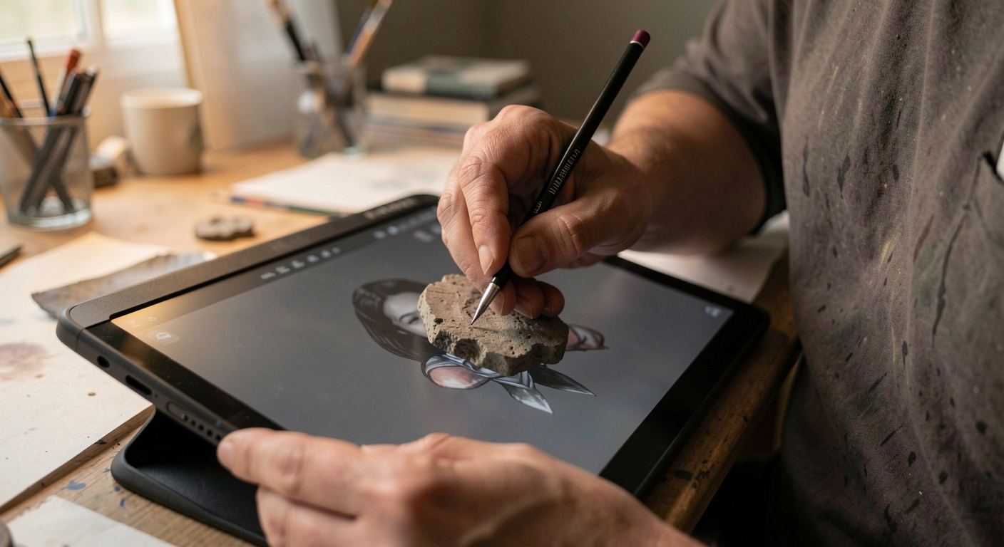
Under every image, in one or two lines: what the job was, who it was for if you are allowed to say, what you contributed if it was a team, and the year. That caption does three jobs at once. It shows you understand a brief, it lets a commissioner picture you in their own job, and it makes the page findable, because search engines read the caption and the alt text while the picture itself stays opaque to them.
Process shots are worth including only where they teach something: a rough against the final, a colour study, a rejected direction. Twelve steps of a painting is a tutorial, not a folio.
5. The site itself
Four pages are enough: the work, a project page pattern, an about page, and a contact address. The about page needs a photograph of you, a plain sentence saying what you make and for whom, your location and your working languages. The contact page needs an email address that you read, written as text, not hidden behind a form that eats messages.
Buy the domain in your own name and keep the folio on it, even if you also post work on social platforms. Platforms change their rules, their layouts and sometimes their existence; a domain you control can be rebuilt anywhere in an afternoon. Keep a local copy of every file you publish. A folio on its own domain also has to be found, and an illustrator's market is narrow enough to be covered completely rather than fought over; the working notes on niche SEO for a site made of images describe that approach through one documented case, with the smallest correct file as the first rule.
A finished portfolio does not attract commissions on its own. Traffic reaches a portfolio through distinct channels: search results, direct visits, referring links, social posts, email, communities and AI assistants, each with a different cost to scale. Search intent matters most, because a visitor typing "children's book illustrator" is closer to hiring than one scrolling a feed. Technical basics still apply: pages must be crawlable and indexable, titles should match the query, and images need descriptive alt text. A reference on organic visibility, such as Happy Traffic, covers these channels and their economics. Weekly work on a few pages beats sporadic posting.
6. Technical checks
- Image size: export at the pixel width the layout actually uses, then check the page weight on a phone connection. A folio that loads slowly is a folio that is not seen.
- Colour: convert to sRGB for the web. A file left in a wide gamut profile can look flat or oversaturated in some browsers.
- Alt text: describe the picture in a sentence. It serves readers using a screen reader first, and retrieval second.
- Page titles: one per page, naming the work and the market. Not "Untitled" and not the file name.
- No PDF only folios. A commissioner will not download a file to decide whether to open it.
- Test on a phone. Most first looks happen there, often between two other things.