Ref CR 01 · Craft Photoshop digital painting: a tutorial for beginners
Method Edition of 20/08/2026 also filed under: raster painting, layers
Digital painting: building an image from brush marks on raster layers, in an order that keeps the big decisions changeable until the small ones are certain.
In short
- Set the pixel dimensions once, at the start, at the size the work will be used.
- Paint values before colour, and check them by removing colour.
- Hide with a mask, never delete with the eraser.
1. Setting up the file
What a screen shows is pixel dimensions. Pixels per inch, ppi, is an instruction for print: it says how many of those pixels to squeeze into an inch of paper. A file of 3000 by 2000 pixels is the same file whether it is labelled 72 ppi or 300 ppi; the label only decides how big it prints. So decide the destination first.
- Print: work at the final physical size at 300 ppi. Large pieces seen from a distance can drop to 150 ppi.
- Screen: work at the largest pixel width the picture will ever be shown at, with some margin for a crop.
- Colour mode: paint in RGB. Convert to CMYK at the end, for print, and expect saturated colours to shift.
- Bit depth: 8 bits per channel is fine for most illustration. Choose 16 bits when heavy gradients or strong tonal corrections are planned, because it resists banding.
2. Brushes, flow and opacity
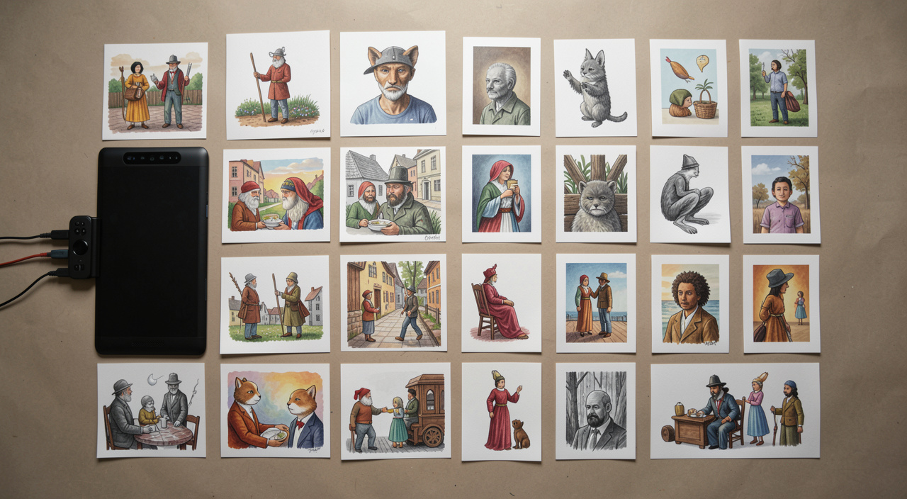
Two sliders confuse every beginner because they look like the same control. Opacity sets the maximum density a single stroke can reach: at 50 per cent you can go over the same stroke a hundred times without passing half strength, as long as you do not release the stylus. Flow sets how fast paint builds up as you move, so a low flow lets one stroke deepen where it overlaps itself. Both stack across separate strokes. With Airbrush mode on, paint keeps building while the stylus is held still.
Start with three brushes, not thirty: a hard round for shapes and edges, a soft round for gradients and light, and one textured brush for surface. Set size and opacity to pressure on a tablet, and leave the exotic brushes until you can already build a form without them.
Hardness is a slider on round brushes, and it deserves as much attention as size: a fully hard edge and a fully soft edge in the same painting is what makes a form look solid rather than airbrushed.
3. Layers and masks
A workable stack for a first painting: background, sketch on top set to multiply and faded, a block in layer for flat shapes, a rendering layer above it, and adjustment layers at the top. Name them. Group them.
- Layer mask: a greyscale channel where black hides and white reveals. Painting on a mask is reversible; the eraser is not.
- Clipping mask: a layer that only shows where the layer below it has pixels. It is how you paint inside a shape without leaving it, and it is the single most useful habit in digital painting.
- Blend modes: Multiply darkens and is right for shadow and for a sketch over white. Screen and Linear Dodge lighten and suit glow. Overlay and Soft Light shift tone and saturation without flattening the value structure underneath.
- Adjustment layers: Curves, Levels, Hue and Saturation applied as layers, so the decision can be revisited or thrown away.
4. Value before colour
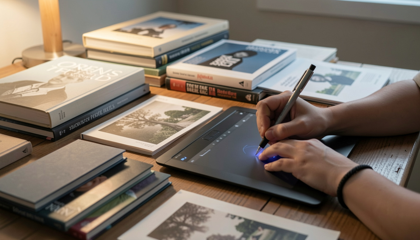
Value is the light and dark structure of a picture. It carries readability; colour carries mood. Beginners who fight colour for hours are usually fighting a value problem.
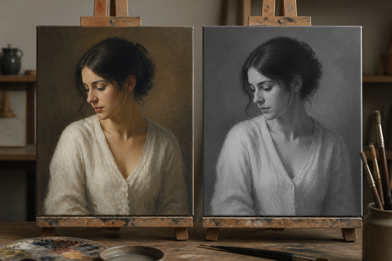
Work the composition first in three to five values only, at thumbnail size, where detail is impossible. Then bring colour in over that structure. To check at any point, add a Black and White adjustment layer at the top of the stack and toggle it: if the picture falls apart in greyscale, no colour choice will save it.
Two habits worth taking early: do not paint with pure black or pure white, because they leave nowhere to go at either end, and keep the lightest light and the darkest dark for the place you want the eye to land.
5. Edges
Edge quality does more for realism than detail does. Four kinds are worth naming: hard, where two forms meet sharply; firm, slightly softened; soft, where a form turns away from the light; and lost, where a shape dissolves into a neighbour of the same value. A form rendered with only one kind of edge reads as plastic.
Hard edges pull attention. Put them where you want the eye, and let the rest of the picture go soft.
6. Shortcuts worth learning
| Action | Windows | macOS | Why it matters |
|---|---|---|---|
| Brush tool | B | B | The tool you return to after every other one |
| Eraser | E | E | Useful on masks, avoidable on pixels |
| Temporary eyedropper | Alt held | Option held | Pick a colour without leaving the brush |
| Swap foreground and background | X | X | Paint and unpaint on a mask in one motion |
| Default black and white | D | D | Resets a mask workflow instantly |
| Brush size down and up | [ and ] | [ and ] | Size changes constantly while painting |
| Brush hardness down and up | Shift + [ and ] | Shift + [ and ] | Edge control without opening a panel |
| Size and hardness on canvas | Alt + right button drag | Control + Option drag | Both at once, without looking away |
| New layer | Control + Shift + N | Command + Shift + N | Cheap, so make one before a risky pass |
| Duplicate layer | Control + J | Command + J | The backup you take before an experiment |
| Clip to layer below | Alt + Control + G | Option + Command + G | Paint inside a shape without leaving it |
| Invert (a mask) | Control + I | Command + I | Turn a reveal into a hide |
| Fit on screen | Control + 0 | Command + 0 | Zoom out often: distance is a tool |
Wide table: scroll it sideways.
7. Exporting
Keep the layered PSD as the master, and never deliver it unless the client has asked for a working file. Flatten a copy for delivery. Convert to sRGB for screen use, so the colours survive the trip through other people's browsers. For print, ask the printer what they want before converting anything: they will usually name a profile and a format.
Two limits worth knowing: the PSD format stops at 2 GB and 30,000 pixels on a side. Past that, Photoshop uses PSB, which goes to 300,000 pixels. If a file is approaching either limit, the painting probably has more layers than decisions.